With over 92 million users in Japan, LINE is much more than a social network; it’s an all-in-one platform for messaging, payments, news, and more. Far ahead of Instagram’s 48 million users, LINE is a daily essential for millions, making it an ideal channel for businesses to connect with audiences. As more brands embrace LINE Ads, crafting the right visuals becomes crucial. Additionally, with over 75% of users interacting with LINE’s services daily, businesses can tap into a highly engaged audience for their campaigns. Here are tips to help you optimize ad images across different formats, along with insights from LINE Creative Lab to enhance your ad’s performance.
Visit the LINEヤフー for Business website
LINE frequently publishes informative articles and organizes online seminars on a variety of themes, from the latest in advertising trends to business account creation. These articles provide key insights into visual styles, popular color schemes, and best-performing layouts. For example, LINE recently highlighted the growing popularity of muted pastel color schemes and minimalistic layouts among younger users and urban professionals. By integrating these elements into your designs, you can better align your creatives with audience preferences and boost engagement. Incorporating these tips and tricks into your ads can help keep your creatives fresh and relevant.
If you can’t read or speak Japanese, there’s also an English version of the website with many resources available. It includes practical tips on ad performance, visual trends, and creative optimization, making it an invaluable resource for marketers and creatives alike.
Make use of the LINE Creative Lab
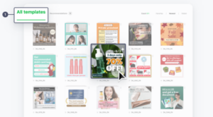
For those who may not have the time or resources to design an ad, the LINE Creative Lab can be used to edit visuals, create ads from scratch, or choose from a variety of ready-made templates. The platform supports multiple formats, allowing you to work with images, animated visuals, and even videos for creating engaging slideshows.

Recently, LINE Creative Lab partnered with Adobe Express, providing access to a powerful editing tool for those looking to enhance their designs. This partnership brings features like AI-assisted resizing, color correction, and customizable templates that help you create polished ads with minimal effort.
For businesses looking to showcase dynamic content, the Lab also includes tools for crafting slideshows that combine visuals and short animations, which is ideal for capturing attention in crowded feeds. You can visit the LINE Creative Lab website to explore all the tools and resources. The templates cater to various industries, making it easier to design targeted campaigns quickly and effectively.
Respect the ad image sizes for different formats
LINE offers four main ad formats, each with specific size requirements to ensure clarity and engagement:
|
Spec |
Image | Carousel | Image (Small) | Animated Image |
|
Size |
1200 x 628 or 1080 x 1080 | 1080 x 1080 | 600 x 400 | 600 x 400 |
|
File Format |
JPG/PNG |
APNG |
||
|
File Size (Max) |
10 MB |
300 KB |
||
|
Title (Max) |
20 letters |
|||
|
Description (Max) |
75 letters |
40 letters |
17 letters |
17 letters |
| Others | / | Up to 10 cards | Ad displays ‘Title’ or ‘Long Title’ according to placement |
Loop: 1 – 4 Frames: 5 – 20 Length: 1 – 4 secs |
Each ad format on LINE serves a unique purpose. Although image and small image formats share similar specifications, the small image format is less suited to displaying text. For text-heavy ads, use the standard image format to ensure legibility. With small images, emphasize a single strong visual that conveys your message at a glance. Carousel ads work particularly well for e-commerce campaigns, as they allow you to showcase multiple products or features in one ad. According to LINE’s internal data, carousel formats can increase click-through rates by up to 20%, making them a powerful option for driving engagement. Experiment with composition, visuals, and even CTA placement to maximize each format’s potential.
Some Tips & Tricks for effective LINE Ad images and videos
Highlight Benefits, Not Just Features
With users spending only about 2 seconds viewing banner ads, it’s crucial to capture their attention instantly. It’s therefore important to prioritize ad copy that clearly conveys the benefits, i.e., what users gain from the product or service, instead of just listing features. For example, a food delivery service might highlight “Fresh meals delivered in 30 minutes” rather than “Quick delivery available.” This approach, according to a study by LINE, can double new customer acquisition rates by emphasizing value over technical details, demonstrating the power of a well-phrased value proposition.
Utilize Video Ads for Enhanced Engagement
Video ads can be more effective than static images for customer acquisition. While they may come with a 1.7x higher CPM (cost per thousand impressions), video ads boast a CTR approximately 5.4x higher, ultimately reducing CPA (cost per acquisition) by around 30%. Despite the upfront investment, video ads can be a powerful tool for engaging potential customers and driving action. For more insights, you can check the latest success story on this topic here.
Simple, Clear Designs Win
Keep your designs clean and focused. Minimal text and a strong visual hierarchy are key, so try to keep text to two lines to enhance readability and highlight the core message. Ample white space can help prevent clutter and draw attention to essential elements. Simple visuals communicate quickly and effectively, increasing your ad’s impact within that critical 2-second viewing window.
Leverage Relatable, User-Like Imagery
When selecting ad images, consider relatable visuals that feel like they could have been taken on a smartphone by a user rather than professionally staged photos. These images can achieve a CTR up to 3.6 times higher than professionally composed shots. Including everyday visuals that align with your target audience’s lifestyle can make your ads feel more relevant and engaging.
Cultural Localization
Tailor your visuals to resonate with the cultural preferences of your target audience. For example, Japanese audiences may respond well to familiar color schemes or culturally significant symbols. Use local trends and symbols that feel both relevant and appealing, creating a stronger emotional connection with viewers.
For example, incorporating elements like cherry blossoms during spring promotions can significantly enhance relevance and engagement. Even color choices can be culturally aligned; for instance, using red and white, which are considered auspicious colors in Japan, during sales or holiday campaigns.
A/B Test Your Creatives for Optimal Performance
Test different ad elements through A/B testing, from visuals to ad copy. For example, assess the performance of benefits-focused copy versus feature-focused copy or relatable, user-like images against professionally composed ones. Small adjustments, such as changing the image, text, or CTA, can reveal insights into what resonates best with your audience. A continuous testing approach helps refine your ad strategy, improving performance metrics like CTR and engagement over time.
For instance, you might test two versions of an ad for a festive season sale—one featuring a modern, minimalist design and another with classic cultural imagery—to determine which is more effective for increasing engagement.
Effective CTAs for Action
A clear call-to-action (CTA) drives results. Use concise, direct CTAs like “Shop Now” or “Sign Up” to guide viewers toward the next step. Ensure the CTA is visually prominent and pairs well with your creative, ideally using contrasting colors to make it stand out and grab attention.
For example, a brightly colored “Book Now” button on a more subdued background can draw the eye quickly, increasing the likelihood of user interaction. Testing different CTA phrasings, such as “Order now!” versus “Make an appointment,” can also help identify which language most effectively motivates your audience.
Conclusion
Creating effective LINE Ads requires more than just meeting technical specifications; it’s about crafting visuals and messages that connect instantly with your audience.
LINE offers a comprehensive suite of tools and resources to help you create impactful ads. Make the most of features like LINE Creative Lab, monthly trend updates, and format options to keep your ads fresh and relevant. Prioritizing benefits, using relatable images, and implementing A/B testing will further refine your approach, driving better results over time. It’s important to remember that the key to success in digital advertising is adaptability and responsiveness to data-driven insights.
If you need assistance in optimizing your LINE ad strategy or creating compelling visuals that resonate with your audience, don’t hesitate to contact us. We’re here to help you achieve your advertising goals!


